In the competitive world of real estate‚ first impressions are crucial. A well-designed flyer can distinguish between a potential buyer’s interest and indifference. Among the myriad design choices‚ the beige and gray real estate flyer stands out for its timeless elegance and universal appeal.
These neutral tones exude sophistication‚ making them ideal for showcasing properties in a professional light. Whether you’re targeting luxury homebuyers or first-time homeowners‚ a beige and gray real estate flyer can convey trustworthiness and class.
Moreover‚ these colors complement various property styles‚ from modern apartments to classic homes. By choosing a beige and gray real estate flyer,you’re not just selecting a color scheme; you’re making a strategic marketing decision that aligns with contemporary design trends and buyer preferences.
See More Real Estate Flyer Template
Neutral colors like beige and gray are more than just aesthetic choices; they’re powerful tools in real estate marketing. Here’s why:
Incorporating neutral colors into your marketing materials can enhance the property’s perceived value. They create a calming effect‚ which can be particularly appealing to potential buyers making significant financial decisions.
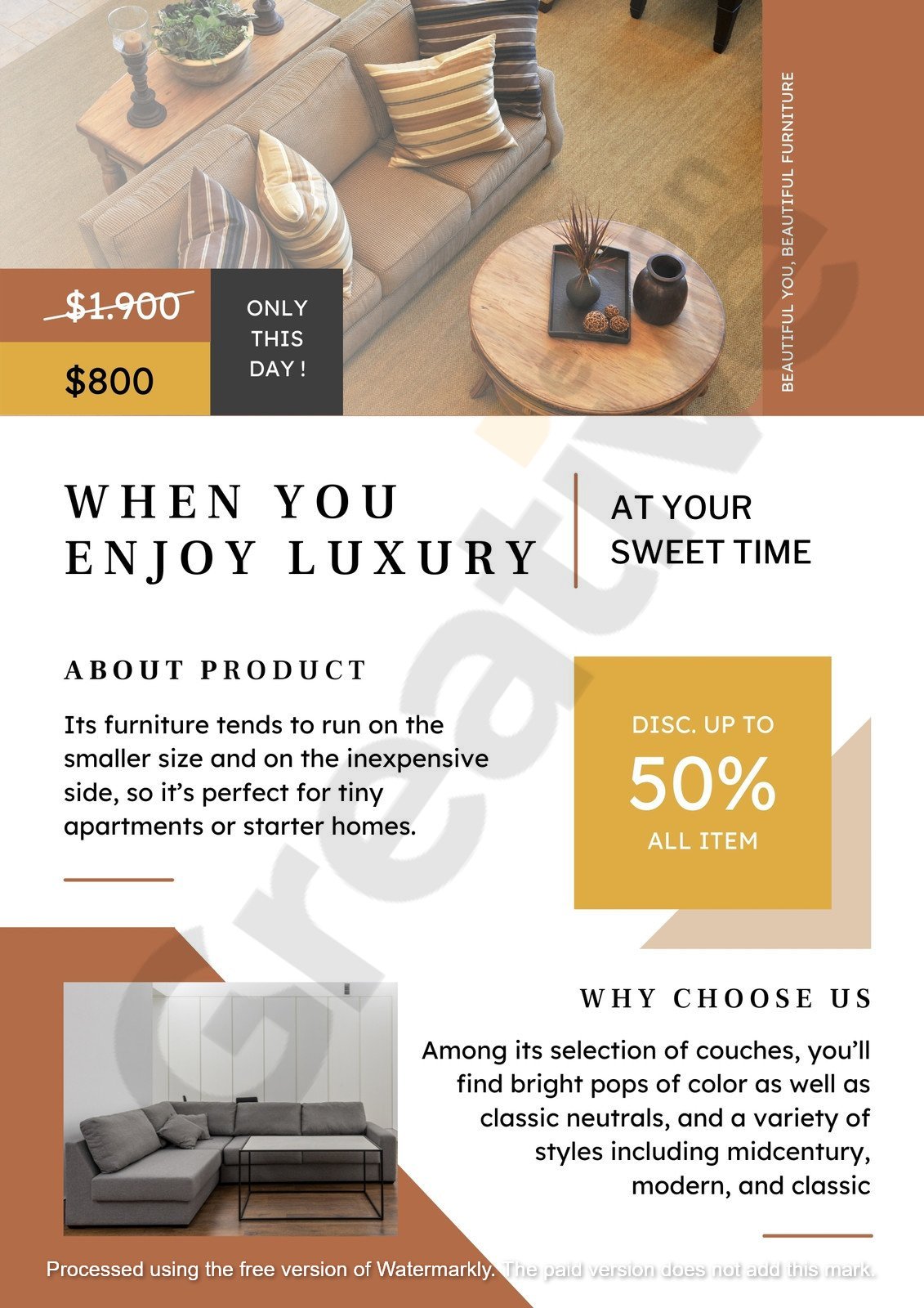
Creating an effective beige and gray real estate flyer goes beyond color selection. Your design must balance aesthetics with function to capture attention and drive inquiries. Below‚ we summarize the essential elements contributing to a professional and persuasive flyer.
Choosing the right typography is crucial. Fonts should reflect sophistication while maintaining readability.

Well-chosen typography reinforces the elegance of your beige and gray real estate flyer and directs the viewer’s attention.
A strategic layout guides the reader’s eye through your content seamlessly.
A structured layout makes the flyer visually appealing and easier to scan.
Imagery must resonate with your color palette and highlight the property’s appeal.
Photos should support the flyer’s message while maintaining its refined style.
Your call-to-action (CTA) must be clear and compelling.
The CTA turns interest into action‚ so don’t let it be an afterthought.
Designing an elegant property flyer using beige and gray requires thoughtful attention to typography‚ layout‚ imagery‚ and CTA strategy. Each element enhances the next correctly‚ resulting in a beautiful and practical flyer. Focus on clarity‚ cohesion‚ and professionalism to ensure your flyer communicates the property’s value to potential buyers.
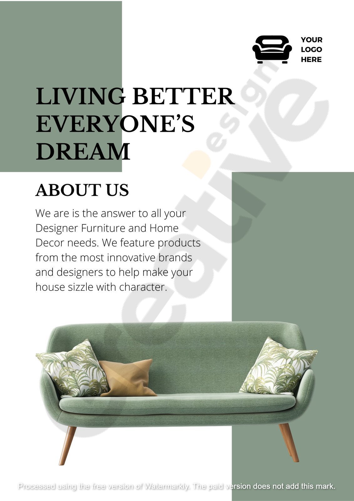
Minimalist design is characterized by simplicity and functionality. When applied to a beige and gray real estate flyer,it can:
Embracing minimalism in your flyer design can lead to more effective communication and a stronger connection with your target audience.
Utilizing a printable real estate flyer template can streamline your marketing efforts. Here’s how:
When selecting a template‚ ensure it aligns with your brand and the property’s unique features. A well-chosen template can significantly enhance your marketing efficiency.
An open house is an opportunity to showcase a property to potential buyers. A stylish open house flyer can:
Investing in a thoughtfully designed flyer can maximize the impact of your open house events.
Incorporating a beige and gray real estate flyer into your marketing strategy offers a subtle yet powerful way to enhance property presentations. These neutral tones communicate sophistication and broad appeal‚ helping your listings resonate with a wide audience. Choosing a palette that balances warmth and professionalism creates an inviting first impression that encourages potential buyers to engage.
A focus on clean design and minimalism elevates your flyer’s visual impact. Clear layouts‚ strategic use of white space‚ and concise copy ensure that your message is accessible and persuasive. Pairing this approach with a well-crafted template allows for consistent branding and easy customization—two essentials for efficient and effective marketing.
To stand out in today’s competitive market‚ leverage effective template use to streamline your workflow while maintaining high-quality output. Neutral tones like beige and gray showcase your properties with elegance and reinforce your brand’s credibility. Invest in design that speaks to buyers’ expectations‚ and your materials will do more than inform—they’ll inspire action.
Arber Allaire is a super-talented logo designer and template creator who has won many international design contests. With a sharp eye for creativity and a love for making things look excellent‚ Arber turns simple ideas into powerful and unforgettable designs. His work stands out in competitions worldwide‚ proving that great design isn’t just about looking good—it’s about telling a story most smartly. If you’ve ever seen a logo that feels just right‚ there’s a chance it was made by Arber Allaire.