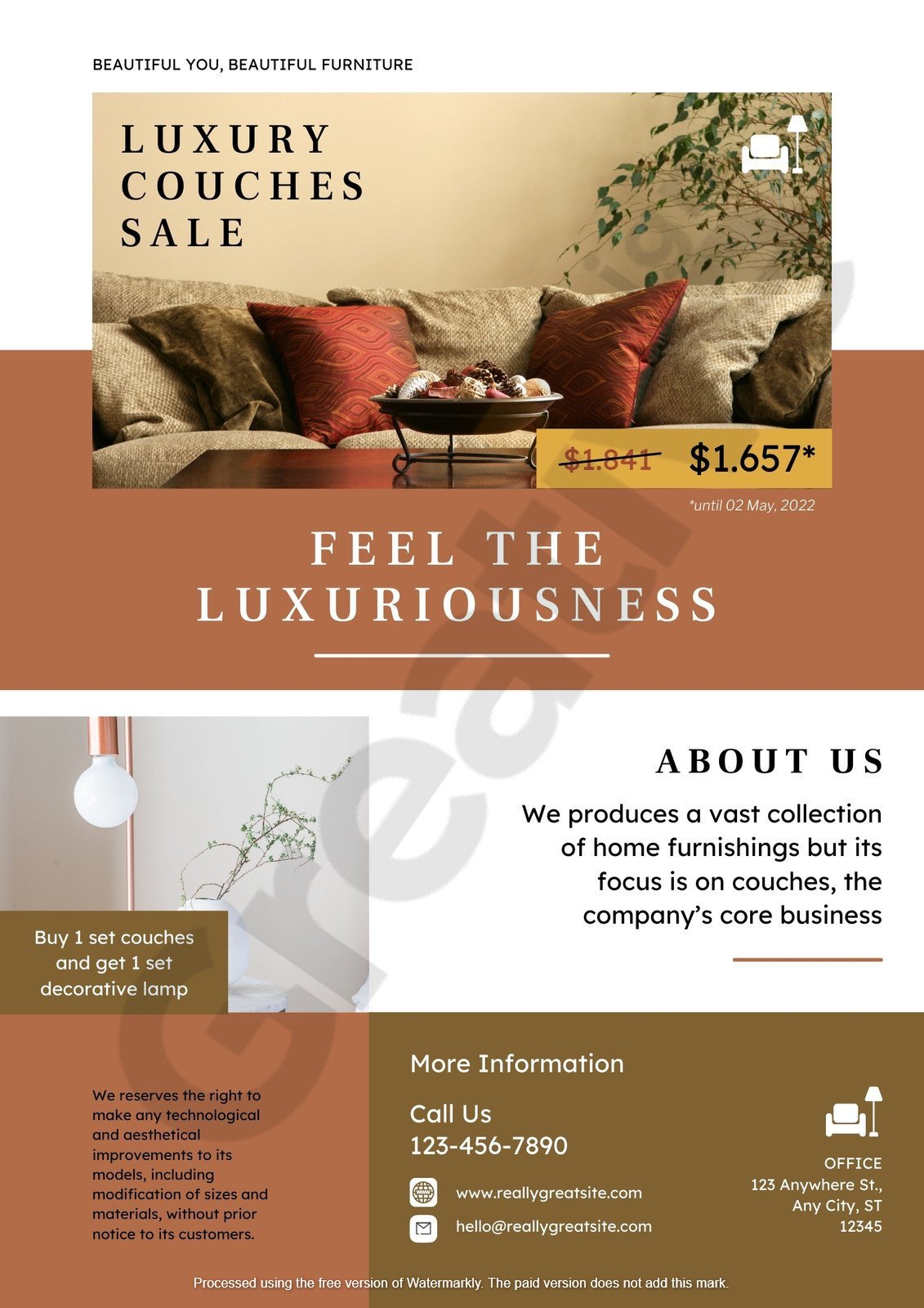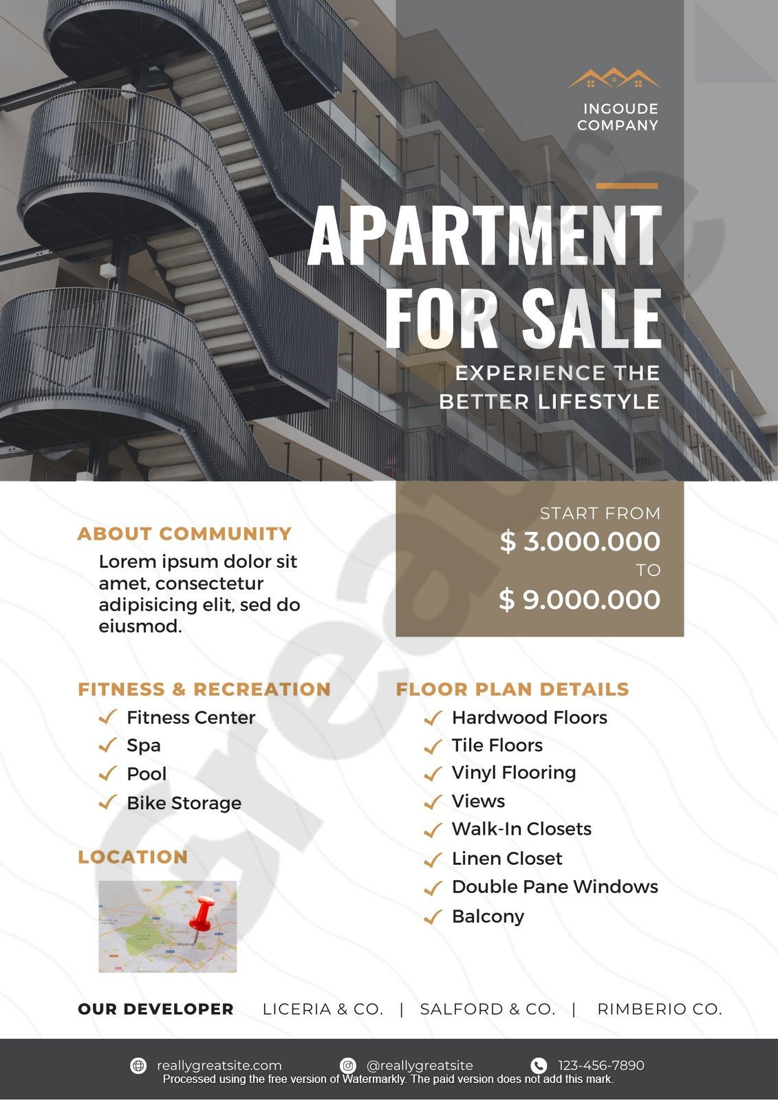

In the competitive world of real estate‚ standing out is crucial. One effective way to capture attention is by using vibrant and meaningful colors in your marketing materials. An orange and green real estate flyer combines energy with eco-consciousness‚ making it a powerful tool for attracting potential buyers.
Orange is associated with enthusiasm and creativity‚ while green symbolizes growth and sustainability. Together‚ they create a visually appealing and psychologically impactful design that resonates with a broad audience.
This article will explore the significance of using orange and green in real estate flyers‚ delve into modern design trends‚ and provide practical tips for creating effective marketing materials.
See More Real Estate Flyer Template
In real estate marketing‚ color psychology is more than just a design choice—it’s a strategic tool. Different colors evoke distinct emotional responses‚ shaping how potential buyers perceive a property. Purposefully‚ colors can highlight property strengths‚ build trust‚ and motivate action. Successful real estate professionals use color as a silent yet powerful persuasion tool in everything from flyers and websites to staging.
The Emotional Impact of Orange and Green
Two standout colors in real estate marketing are orange and green—each influencing buyer behavior uniquely.
Strategic Application in Marketing Materials

To maximize engagement‚ real estate marketers should incorporate these colors thoughtfully across different media:
Consistency is key. Maintaining a cohesive color scheme enhances brand recognition and visual appeal‚ whether on a flyer‚ website‚ or social media post.
Real-World Examples of Color in Action
Consider a listing flyer for a newly renovated townhouse. The flyer instantly draws the viewer’s eye by using orange for “Just Listed” banners and contact buttons. Meanwhile‚ green imagery of nearby nature trails and energy-saving appliances reinforces the home’s sustainable value. These color choices guide the buyer’s attention while reinforcing the emotional narrative of the listing.
Agents have also seen success by matching color palettes to the property type. A luxury penthouse might lean on blacks and golds for sophistication‚ while a suburban family home could use orange to convey energy and warmth.
Key Takeaways and Best Practices
Incorporating color psychology into your marketing isn’t just visually appealing—it’s an evidence-backed approach to influence perception and drive decisions. Focus on:
By leveraging the emotional power of color‚ you create deeper connections with buyers and guide them toward taking the next step. Start reviewing your current marketing assets—could your palette be working harder for you?
Consistent use of orange and green in your marketing materials can strengthen brand recognition. These colors can differentiate your listings in a crowded market‚ signaling a commitment to innovation and sustainability.
For instance‚ orange for headings and green for backgrounds or accents can create a balanced and professional look. This combination not only attracts attention but also effectively communicates your brand values.
Contemporary real estate flyers emphasize simplicity and clarity. Key trends include:
Incorporating orange and green within these modern design frameworks can result in flyers that are both aesthetically pleasing and effective in communication.
An organized layout ensures that potential buyers can quickly grasp the essential information. Consider the following structure:
This layout presents information clearly and leverages color psychology to influence buyer behavior.
In today’s environmentally conscious market‚ highlighting sustainable features can be a significant selling point. Green in your flyer can symbolize eco-friendliness‚ aligning with properties that boast energy-efficient appliances‚ solar panels‚ or sustainable building materials.
Additionally‚ consider using recycled paper for printed flyers or offering digital versions to reduce environmental impact. This approach appeals to eco-conscious buyers and reflects a responsible and modern brand image.
Utilizing an orange and green real estate flyer is more than a design choice; it’s a strategic marketing decision. By understanding color psychology‚ embracing modern design trends‚ and promoting sustainability‚ you can create compelling flyers that resonate with today’s buyers.
Remember‚ the goal is to create a flyer that informs and inspires action. With thoughtful design and purposeful color‚ your marketing materials can stand out and make a lasting impression.
Arthur Perez is a world-renowned design and template creation expert celebrated for his innovative approach and unmatched creativity. With an eye for detail and a deep understanding of aesthetics‚ he has consistently set new standards in the industry. His designs seamlessly blend functionality with artistic elegance‚ making him a sought-after figure in digital and print design.