Creating a fashion newspaper poster is more than combining style and news—it’s about telling a visual story that grabs attention. These posters are designed to reflect the trends of the fashion industry while maintaining an artistic flair. Whether you’re a designer‚ student‚ or fashion enthusiast‚ understanding how to craft and appreciate fashion newspaper posters can offer a unique perspective on visual communication.
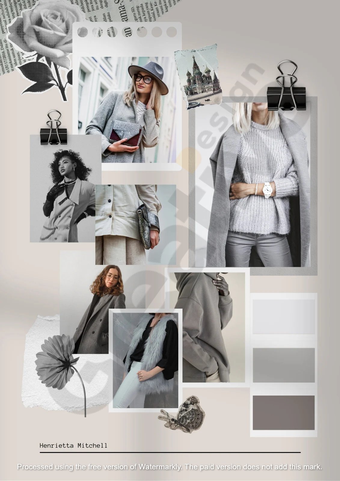
Fashion newspaper posters have gained popularity in recent years for their aesthetic appeal and vintage layout. These designs often use black-and-white tones‚ serif fonts‚ and editorial-style photography. They evoke a sense of nostalgia while staying modern with current fashion elements. This hybrid style is widely used in fashion campaigns and student portfolios.
A well-designed fashion newspaper poster balances bold headlines‚ striking images‚ and engaging text. This layout draws the viewer’s eye and keeps them interested in the message being conveyed. Using grids and columns also helps create a structured and professional look‚ ideal for presenting fashion collections or event announcements.
See More Fashion Newspaper Posters Template
Typography plays a critical role in setting the tone of a fashion newspaper poster. The font choice can communicate elegance‚ modernity‚ or a retro vibe. For instance‚ serif fonts bring a classic newspaper feel‚ while sans-serif fonts give a cleaner‚ contemporary look. The headline often uses bold typography to attract attention immediately.
Using the right font pairing ensures the design is cohesive and easy to read. Designers often combine one typeface for headings and another for body text. This contrast not only enhances readability but also adds visual interest. It helps guide the viewer through the different sections of the poster.
Hierarchy in typography is also key when organizing information. Larger font sizes are used for titles‚ while smaller text provides supporting details. This hierarchy makes it easier for readers to digest the content quickly. A carefully curated fashion typography style can significantly enhance a poster’s effectiveness.
Photography is a powerful visual element that defines the mood of a fashion newspaper poster. High-quality images showcase clothing details‚ textures‚ and the model’s expression‚ all contributing to the story. Fashion photography brings emotion and personality to the design.

Black and white photography is a common choice for this type of poster because it aligns with the classic newspaper aesthetic. However‚ selective use of color can also highlight specific elements‚ such as a brand logo or accessory. This contrast draws the eye and creates a focal point.
The composition of the photos is just as important as their quality. Designers often use full-body shots‚ close-ups‚ and candid moments to create visual diversity. These variations can make the layout more dynamic and engaging. Effective fashion photography selection elevates the entire poster.
The layout of a fashion newspaper poster determines how viewers interact with it. A grid-based layout is standard‚ helping organize images and text to be clean and balanced. This structure mimics traditional newspapers‚ giving the design an authentic touch.
White space is another critical component. It prevents the poster from looking overcrowded and allows key elements to stand out. Strategic margins‚ spacing‚ and alignment help guide the viewer’s eye smoothly across the design.
The layout also affects the pacing of information. By breaking content into digestible blocks‚ designers make it easier for readers to absorb the message. A strong poster layout can turn a simple announcement into a compelling visual experience.
Color can set the tone and mood of a fashion newspaper poster. While many designs stick to monochrome for that vintage feel‚ others introduce color to emphasize modernity or brand identity. The choice depends on the message and target audience.
Neutral palettes often work well in high-fashion contexts‚ where the focus is on clothing and detail. On the other hand‚ bold colors suit streetwear or pop fashion themes. A well-thought-out palette supports the overall narrative without overpowering it.
Color psychology also plays a role. For example‚ red can convey passion and energy‚ while blue suggests calm and trust. Designers must consider what emotions they want to evoke. Picking the right color scheme enhances the emotional appeal of the poster.
Fashion newspaper posters are a powerful medium for blending creativity and communication. They offer a timeless way to present fashion narratives‚ campaigns‚ or events with clarity and style. Through thoughtful typography‚ stunning photography‚ and structured layout‚ these posters become more than just prints—they turn into visual stories.
Their versatility makes them ideal for professional designers and students looking to showcase their work. Whether displayed in a gallery‚ handed out at a fashion show‚ or featured in a lookbook‚ fashion newspaper posters leave a lasting impression. They speak to both the artistic and informative sides of the fashion world.
As the fashion industry evolves‚ so will how we present and consume style. Fashion newspaper posters perfectly exemplify how tradition and innovation can coexist beautifully. Mastering this format means staying connected to the roots of fashion communication while exploring new‚ exciting directions.
Robert Leggett is a super creative template designer who loves making awesome designs daily! He gets super excited about colors‚ shapes‚ and cool layouts that make things look amazing. Robert is always learning new design tricks and keeping up with the latest trends so his templates stay fresh and exciting. Whether for websites‚ posters‚ or anything else‚ he loves turning ideas into beautiful designs everyone can enjoy. If there’s something new in design‚ you can bet Robert knows about it first.