In today’s corporate world‚ a well-crafted letter of recommendation can significantly impact a candidate’s career trajectory. It’s not just about the words; the design and presentation are crucial in conveying professionalism and credibility.
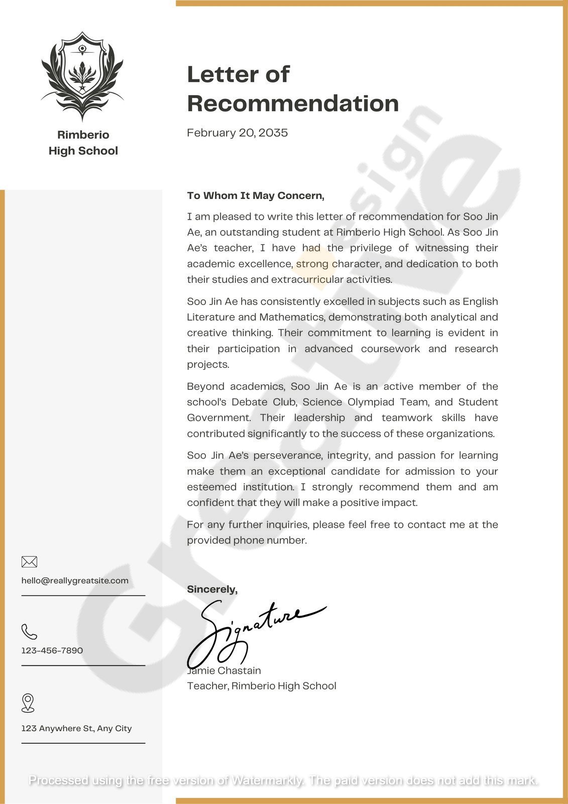
A corporate letter of recommendation is a testament to an individual’s skills‚ work ethic‚ and character. It exudes elegance and authority when designed with a navy blue and gold theme. These colors are not arbitrary choices; they symbolize trust‚ stability‚ and success—qualities every professional letter should embody.
The navy blue color represents depth‚ expertise‚ and confidence. It’s a color often associated with professionalism and reliability. On the other hand‚ gold signifies achievement‚ prestige‚ and high quality. You create a visually appealing and meaningful palette that enhances the letter’s impact.
Moreover‚ the design elements of the letter‚ such as layout‚ typography‚ and spacing‚ contribute to its readability and overall impression. A clean‚ modern design ensures the content is easily digestible and leaves a lasting impression on the reader.
In this article‚ we’ll explore the importance of a professional corporate letter of recommendation‚ delve into the significance of the navy blue and gold color scheme‚ and provide insights into creating a minimalist‚ modern‚ and elegant letter that stands out.
A corporate letter of recommendation is more than just a formality; it’s a powerful tool that can open doors for professionals seeking new opportunities. It gives potential employers or clients a credible endorsement of an individual’s capabilities and character.
Such letters are often used in various scenarios‚ including job applications‚ promotions‚ or business partnerships. They offer insights into the candidate’s work ethic‚ achievements‚ and interpersonal skills from someone who has directly observed their performance.
The credibility of the recommender plays a significant role in the letter’s effectiveness. A recommendation from a respected professional or supervisor carries weight and can significantly influence the recipient’s perception of the candidate.

Moreover‚ the tone and language of the letter should reflect professionalism and sincerity. Specific examples and anecdotes that highlight the candidate’s strengths and contributions are essential‚ making the recommendation more compelling and personalized.
Incorporating a well-thought-out design‚ such as a navy blue and gold theme‚ further enhances the letter’s professionalism. It demonstrates attention to detail and a commitment to quality‚ reinforcing the positive attributes mentioned in the content.
In summary‚ a corporate letter of recommendation is a vital document that‚ when crafted thoughtfully‚ can significantly impact a professional’s career. Combining strong content with an elegant design ensures the letter leaves a lasting impression.
The choice of colors in a corporate letter of recommendation is not merely an aesthetic decision; it carries psychological implications that influence the reader’s perception. The navy blue and gold color scheme is popular for professional documents due to its symbolic meanings and visual appeal.
Navy blue is associated with trust‚ intelligence‚ and authority. Its color conveys a sense of stability and professionalism‚ making it ideal for formal documents. It sets a serious and respectful tone when used as the primary color on a letterhead or border.
Gold,on the other hand‚ symbolizes success‚ achievement‚ and high quality. It’s often used to highlight essential elements or accents in a design‚ drawing attention to key areas without overwhelming the overall look. In a letter of recommendation‚ gold can be used sparingly to emphasize the recommender’s name or the candidate’s achievements.
Combining these two colors creates a balance between seriousness and elegance. The navy blue provides a solid foundation‚ while the gold adds a touch of sophistication. This combination ensures that the letter stands out in a stack of documents‚ capturing the reader’s attention and conveying a message of excellence.
Incorporating the navy blue and gold color scheme into your letter of recommendation enhances its visual appeal and reinforces the positive attributes associated with these colors. It’s a subtle yet effective way to make your recommendation more impactful.
When crafting a corporate letter of recommendation,simplicity is key. A clean‚ uncluttered format ensures that the content is easily readable and that the message is conveyed effectively. Overly complex designs or verbose language can distract from the letter’s purpose and dilute its impact.
A minimalist recommendation letter template focuses on essential elements‚ such as the recommender’s contact information‚ the recipient’s details‚ a clear introduction‚ specific examples of the candidate’s strengths‚ and a concise conclusion. Each section should be well-defined‚ with appropriate spacing to enhance readability.
Using straightforward language is equally important. Avoid jargon or overly technical terms that may confuse the reader. Instead‚ use clear and concise sentences that convey your message effectively. For instance‚ instead of saying‚ “The candidate exhibits a high level of proficiency in project management‚ ” you could say‚ “The candidate effectively manages projects from start to finish.”
In terms of design‚ a modern corporate letter layout with a navy blue and gold color scheme can enhance the letter’s professionalism without distraction. This can be achieved by using navy blue for headers‚ borders‚ or section dividers while reserving gold for subtle highlights—such as the candidate’s name‚ the recommender’s signature‚ or key accomplishments mentioned in the text. By doing this‚ the letter maintains visual harmony and elegance while naturally guiding the reader’s eye to the essential details.
Simplicity in both format and language ensures the letter remains accessible to a broad audience. Whether it’s being read by an HR representative‚ a department manager‚ or a board member‚ the content should be understandable at a glance. A clean layout with consistent fonts‚ bullet points for skills or achievements‚ and neatly aligned margins all contribute to a document that feels well-organized and easy to digest.
Additionally‚ it’s a good idea to maintain consistent font choices—such as using a sans-serif font like Calibri or Helvetica for body text and a slightly stylized serif like Georgia for headers. This typographic contrast adds structure to the letter without overwhelming the design. Font sizes should be comfortable to read‚ ideally between 11 and 12 points for the body and slightly larger for titles or section headings.
Ultimately‚ the goal is to let the recommendation speak for itself. The letter’s structure and visuals should support the message—not overshadow it. When a reader can absorb the content without stumbling over cluttered design or unclear language‚ the recommendation’s impact increases significantly.
Now that we’ve explored the importance of simplicity and design‚ let’s dive into the structure of an impactful corporate recommendation letter and how to compose one that leaves a lasting impression.
Typography and layout play a crucial role in the readability and professionalism of your corporate letter of recommendation. A well-chosen font paired with a clean layout ensures your message is delivered clearly and persuasively.
Fonts:
Use a professional‚ serif‚ or sans-serif typeface like Times New Roman,Garamond,Calibri,or Helvetica. These fonts are universally accepted and easy to read. Avoid overly decorative or stylized fonts—they can detract from the formality of the letter.
Font size:
Stick to a 12-point font for the body and use bold or slightly larger sizes (like 14-point) for headers or names that need emphasis. It strikes a balance between readability and sophistication.
Spacing and margins:
Ensure you use standard margins (typically 1 inch on all sides) and line spacing of 1.15 to 1.5. It prevents the letter from looking cramped and allows each section to stand out.
Header and footer usage:
In a navy blue and gold letterhead design,the top of the letter often includes the sender’s name‚ title‚ and contact information‚ aligned with the branding colors. A thin horizontal line in gold or navy can separate this header from the rest of the letter for a clean‚ structured appearance.
A standout letter must have all the right components‚ each contributing to the overall message. Here’s a breakdown of what to include:
Include your name‚ title‚ company name‚ and contact details—ideally styled in navy blue text or highlighted with gold elements for visual consistency.
Include the date just below the header‚ followed by the recipient’s name‚ title‚ and company name.
Use a formal greeting like “Dear [Recipient’s Name]” or “To Whom It May Concern” if the recipient is unknown.
Briefly introduce yourself‚ explain your position‚ and describe how you know the candidate. Mention the capacity in which you’ve worked together.
Example:
“I am pleased to write this letter of recommendation for Ms. Sarah Linton‚ who served as a Senior Analyst on my team at BrightPoint Consulting for three years.”
Include 1–2 paragraphs with specific examples of the candidate’s achievements‚ work ethic‚ leadership‚ and interpersonal skills. Quantify accomplishments when possible.
Example:
“During a critical client project‚ Sarah led a cross-functional team that delivered results two weeks ahead of schedule‚ saving the client over $25,000 in operational costs.”
Reaffirm your recommendation‚ offer your contact information for follow-up‚ and end with a professional closing.
Example:
“I highly recommend Sarah for any leadership position. Please get in touch with me at john.doe@email.com if you require further information.”
Sign the letter digitally or by hand and include your typed name and title.
One of the biggest design trends 2025 is modern minimalism—clean lines‚ uncluttered layouts‚ and simple color palettes. A minimalist recommendation letter template using navy blue and gold blends this aesthetic with corporate credibility.
Avoid clutter. Let your margins breathe. Use navy for headings and gold for subtle lines or icons. Your layout should look like it came straight from an executive’s desk: sleek‚ refined‚ and well-thought-out.
A corporate recommendation letter design doesn’t need to shout to be heard. Instead‚ it commands attention through visual elegance and precise content.
In the digital era‚ most letters of recommendation are sent via email or uploaded as part of an application process. Here’s how to make sure your beautifully designed letter looks good both on screen and in print:
Also‚ remember accessibility: dark navy blue text on a white background is easier on the eyes than bright gold text. Use gold only for accents‚ never for body text.
If you’re not a graphic designer‚ don’t worry—several tools and platforms offer corporate letter of recommendation templates that match this elegant aesthetic. Here are a few to explore:
| Platform | Features | Pricing |
|---|---|---|
| Canva | Drag-and-drop editor‚ free templates in navy/gold | Free + Pro |
| Microsoft Word | Classic templates with room for customization | Subscription |
| Google Docs | Easy to share and collaborate‚ minimalist layouts | Free |
| Adobe Express | Design-focused‚ includes gold-accented letterheads | Free + Pro |
These tools allow you to integrate your content into a beautifully designed template easily.
To wrap things up‚ here are a few final tips to ensure your corporate letter of recommendation leaves a memorable impression:
A corporate letter of recommendation isn’t just about what you say—it’s also about how you present it. By combining the depth of content with the elegance of a navy blue and gold color scheme‚ you communicate credibility‚ prestige‚ and attention to detail.
Whether endorsing a colleague for a new role or vouching for a business partner‚ using a modern corporate letter layout ensures your message stands out. With clean lines‚ minimalist design‚ and impactful words‚ your recommendation will be one to remember.
Robert Leggett is a super creative template designer who loves making awesome designs daily! He gets super excited about colors‚ shapes‚ and cool layouts that make things look amazing. Robert is always learning new design tricks and keeping up with the latest trends so his templates stay fresh and exciting. Whether for websites‚ posters‚ or anything else‚ he loves turning ideas into beautiful designs everyone can enjoy. If there’s something new in design‚ you can bet Robert knows about it first.